

Cross feat.
—
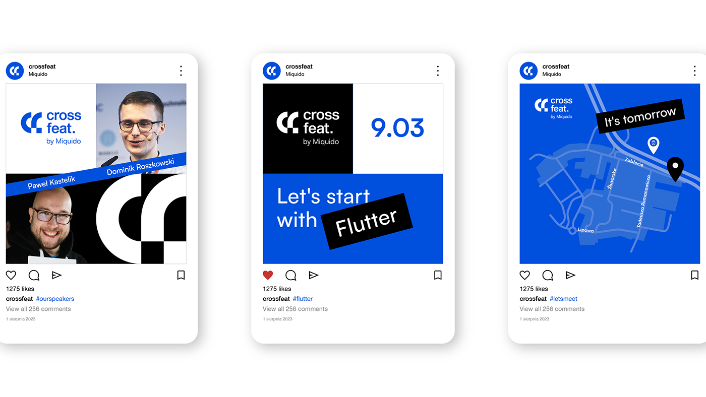
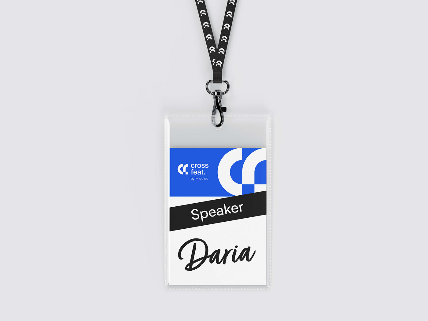
A meetup about cross-platform technologies organised by Miquido.
The brand symbol combines a graphic shape inspired by the first letters of the name and a dot. It also refers to wordplay and references to crossfit. The result is a bold visual identity that reflects Cross feat. brand strategy and its needs.
Mar 9 2023, Cracow, Miquido HQ
Credits:
Visual identity – Anna Gruszkowska
Photos – Spark Collective


Thanks for watching!


